The Local Display Controls affect the visual style of individual entities (such as
shaded or wireframe).
These controls are located within the tree list, and each
affects the specific entity that it appears beside.
Entity Display Icons
Entities are displayed or
hidden by toggling the corresponding icons (located next to each line item in the tree view).
The following rule applies:
A bold icon next to an entity (components/parts, systems, etc.) represents that the
entity is currently displayed.
A dimmed icon represents that the entity is turned off from
display.
For section cuts - the graphical manipulator is linked to the entity display. Therefore
if a section cut or streamline rake is not displayed; the display of the graphical
manipulator is also turned off.
Colors
Certain entities can be colored
individually. The currently assigned color displays in the column.
To change an entity's color: click the current color box in the Results Browser, select a theme from the drop-down menu (Default, Median, or
Rainbow), and pick a color from the palette. Figure 1. Color Picker
Tip:
You can also change an entity's color from themodeling window context menu or theEntity Editor.
Click in the color palette to assign and save custom colors using
the Color Picker dialog.Figure 2.
Display Mode
Components (parts) and
Sets have several display states. You can select these display modes by
left-clicking the small icons in the column for each component or set.
Left-clicking opens a pop-up
menu from which you can choose the new style.
Depending on which option you select,
the entity displays differently:
 column.
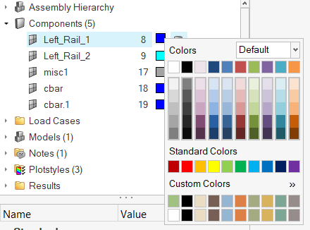
 in the color palette to assign and save custom colors using
the Color Picker dialog.
in the color palette to assign and save custom colors using
the Color Picker dialog.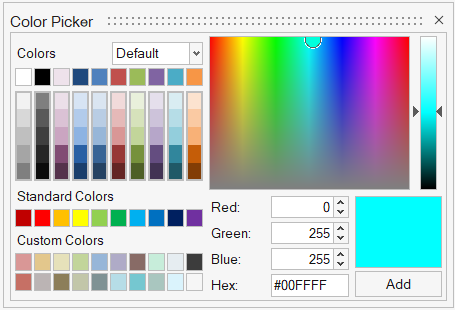
 column for each component or set.
 Wireframe elements
 Shaded elements and mesh lines
 Transparent elements (no mesh)
 Shaded elements and feature lines (no
mesh)
Shaded elements and feature lines (no
mesh) Shaded elements (no mesh)
  Point
Point Sphere